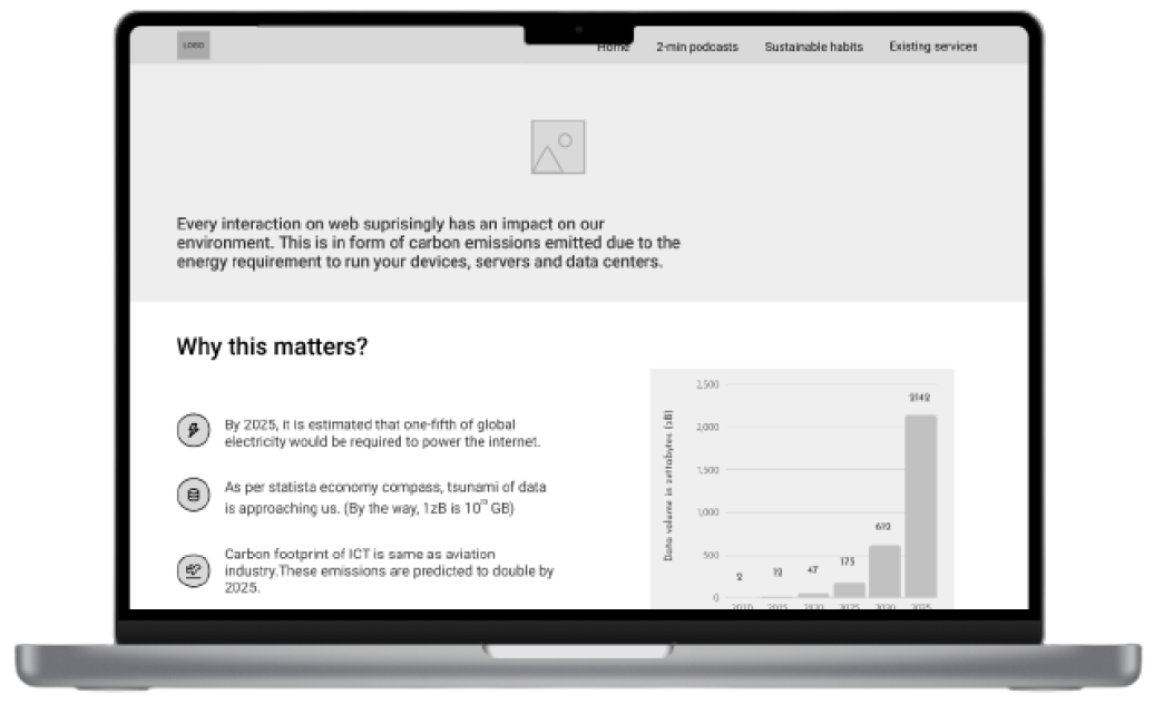
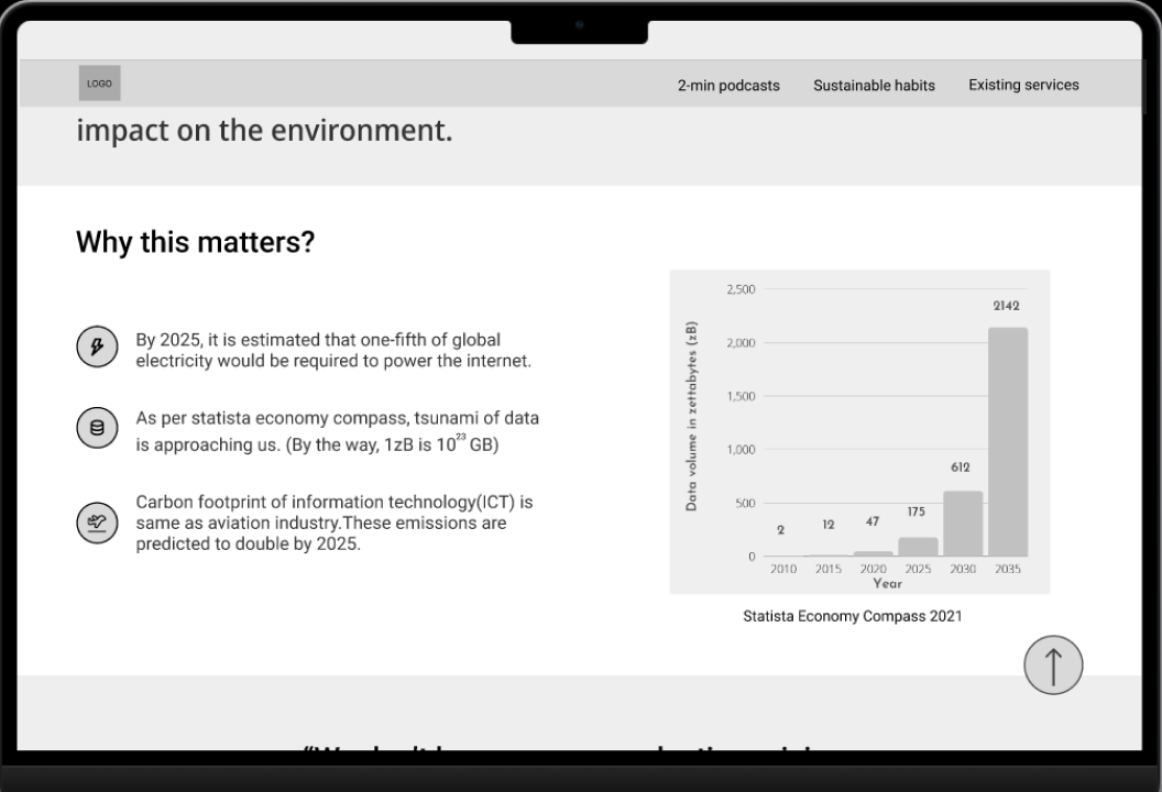
People tend to have a misconception believing that going digital is green and often take digital services for granted, although all the online activities come with a cost to the environment in the form of carbon emissions due to the energy requirements to run the devices and power the wireless networks.
The carbon footprint of the information technology (IT) sector is similar to that of the aviation industry. In 2025, it is predicted that one-fifth of global electricity will be needed to power the internet alone. I conducted a study to evaluate users' digital habits to gain insights for a prototype that attempts to shed light on the big issue of digital waste.
project brief
Role - Product Designer
Tools - Figma, Adobe Audition
Timeline - 3 months
Key deliverables - Surveys, Design sprint, User personas and User journey mapping, Concept testing, Information Architecture, Usability testing, Wireframing, High-fidelity prototyping.
design goal
The goal of the design and user research is to understand how Internet users generate digital waste, and propose solutions to create awareness and hopefully help them to adopt better practices.
challenge
1- How will the final artefact reach out to the the mass internet users while not significantly contributing towards digital pollution itself?
3- How can we encourage individuals to incroporate green internet habits without them losing the comfort of using the internet.
2- What device/technology would be appropriate for our problem?
methodology
To learn and gain insights into the digital habits of the users.
For acquiring a knowledge base required for running awareness campaign.
Co-design session
To learn about digital habits from users to aid later in the creation of personas, user journeys and problem statements.
For ideation of how might we statements with users.
Initial testing of prototypes and getting early feedback to get a direction for the final digital artefact.
Usability testing of the digital artefact with the target audience with some prompts to further clarify the concept and to list quick wins for the next iteration.
design process
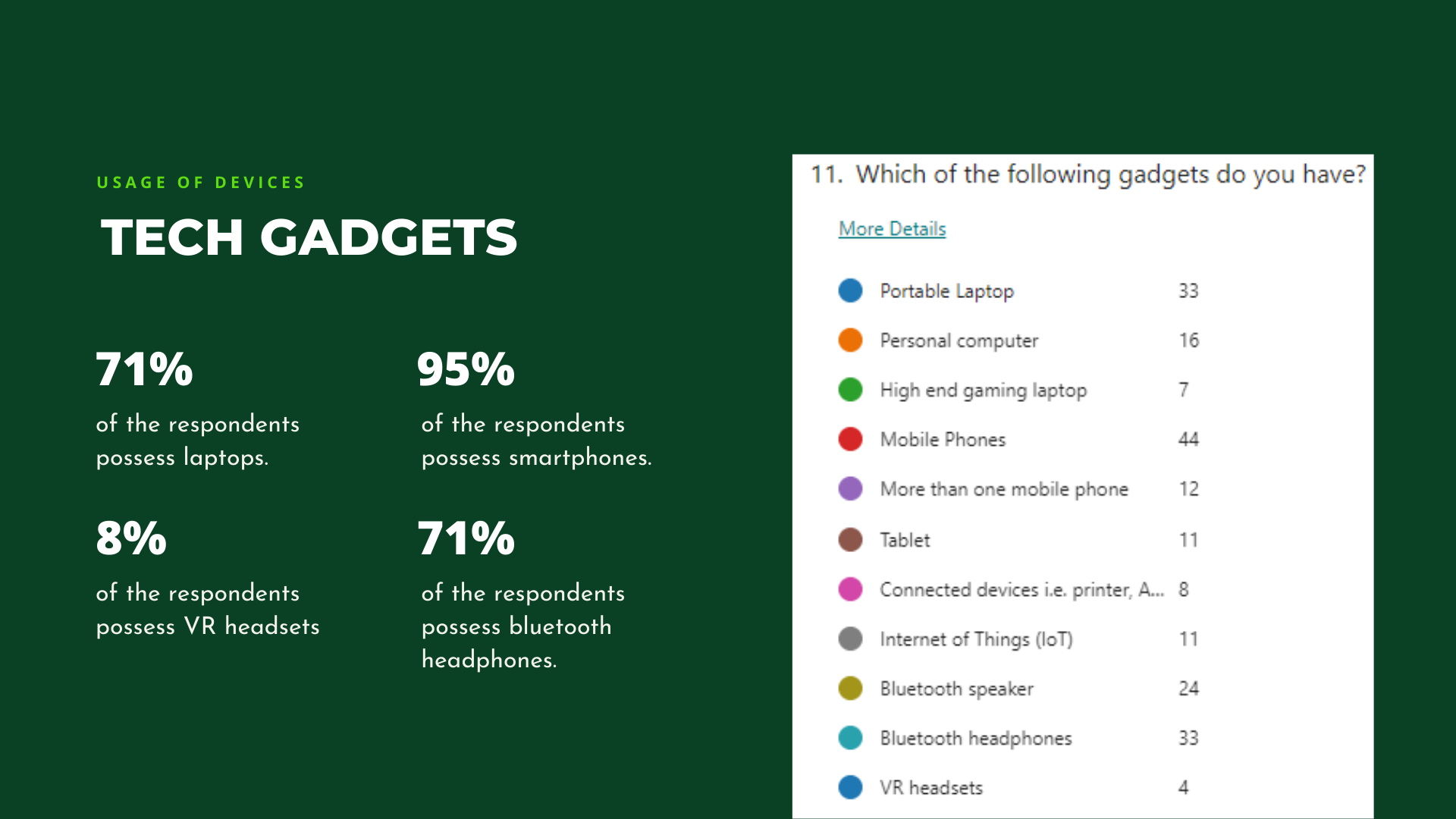
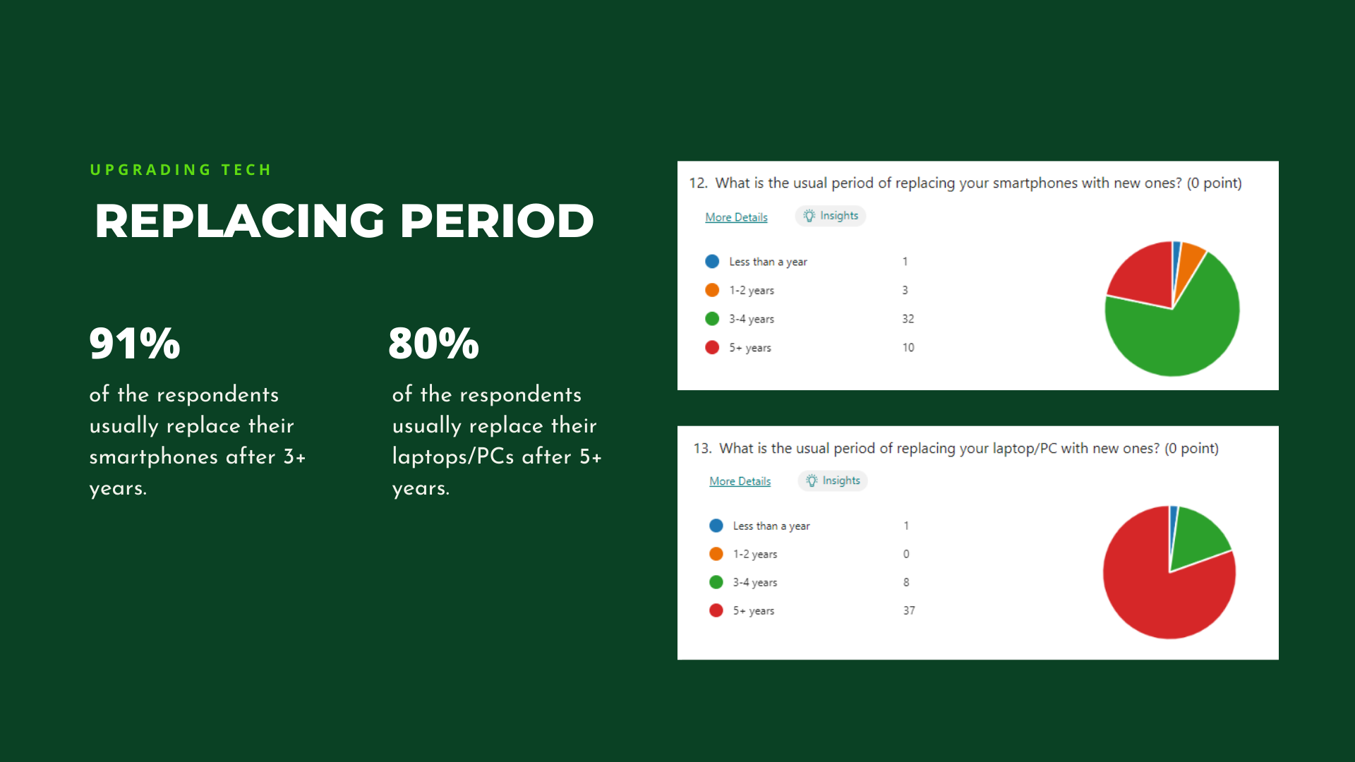
survey insights
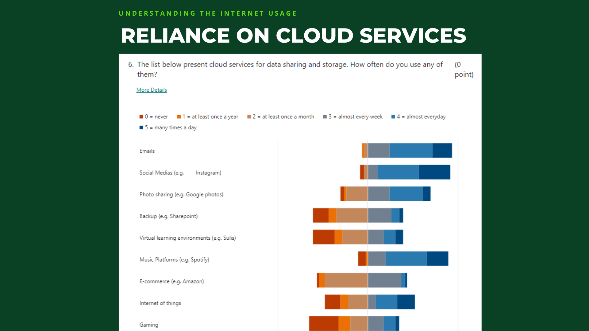
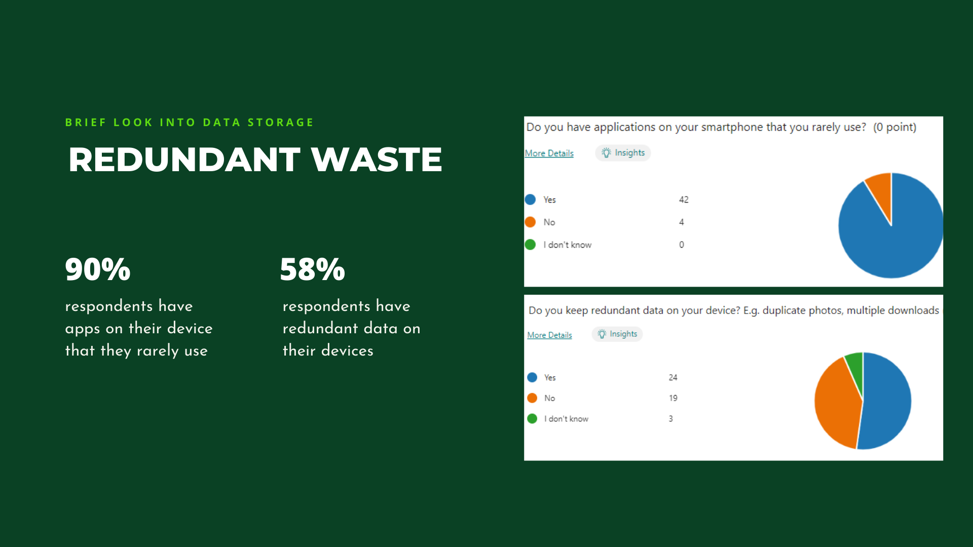
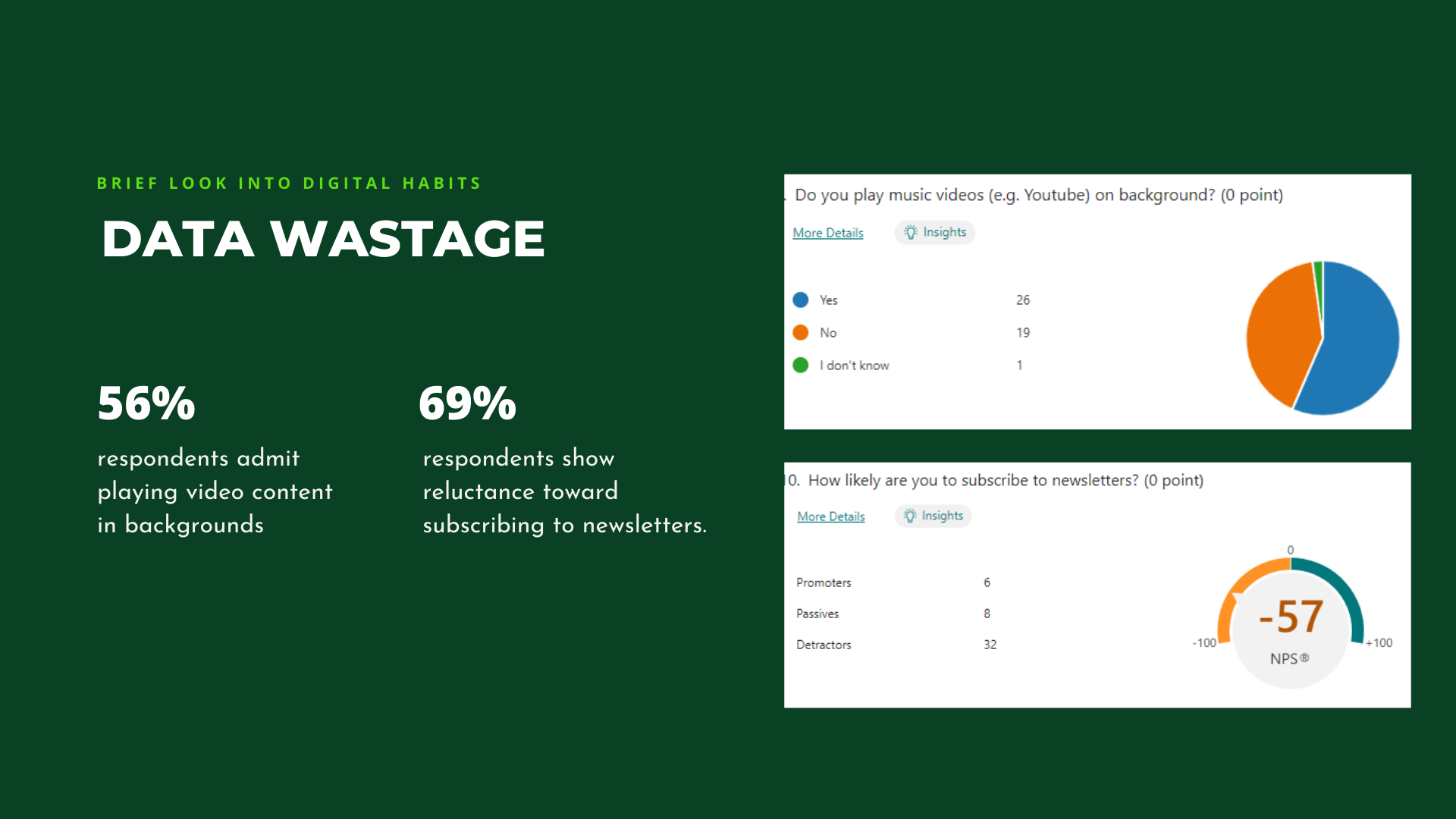
A total of 46 responses were collected for the purpose of this study, with the majority of responses (about 84%) being filled out by the age group 21-30. Regarding gender, participants declare 56% men and 41% women.
Co-design session
i)Workshop activities
Part 1 - Exploring digital habits
The session started with me briefly informing the participants about their role in this study and what they could expect during the session. The first activity required them to walk through their day with everyone around them, considering how they utilise digital technologies and devices. The idea behind this activity was to act as an icebreaker between the participants and to further empathise with digital habits.
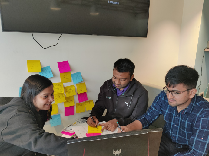
Part 2 - Ideation
After completing the first activity, I now explained to my participants about digital waste. This was not shared at the beginning in order to avoid any biases or self-judgement in participants' input in the first activity.
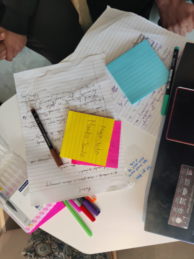
This also gave way to the second activity, where I wanted them to brainstorm ideas for how might we statements. To facilitate that, I started presenting some HMW (how-might-we) statements that I had framed ahead of the session.
For the following activity, the participants were given post-it notes and encouraged to come up with at least one crazy idea to ease everyone up. Additionally, they were asked not to judge anyone's ideas at any point. Later after a short span, the participants were asked to go through ideas they brainstormed together on the wall and pick personal favourites with their respective markers. The participants showed quite an enthusiasm while doing so, they further added to each other's ideas to expand the possibilities.
Part 3 - Concept testing
The final activity for the session was to inform the possible direction of digital artefact. For the purpose of this activity, four distinct ideas were presented: web browser extension, augmented reality - AR, social media and blogpost. Virtual Reality - VR was initially considered in the list of possible ideas but was removed later after the survey as it depicted that the respondents lacked access to this medium.
Below are the comments that were recorded while testing with participants:
Web browser extension
Presents privacy issues with an extension keeping track of sites users are visiting.
It needs to be added to browser, so it would not do a great job at reaching the mass audience,
Augmented reality (AR)
Users do not have much experience using AR applications.
It needs to be installed on smartphone, would contribute further to digital waste.
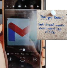
Blogpost
Would be more accessible.
Would only suit users who are into reading blogs on internet.
Participants felt that the content needs to be informal and concise.
Social media post
More accessible as everyone's on social media these days.
Content is informal, concise and is something that they would read.
ii) Analysis and Outcomes
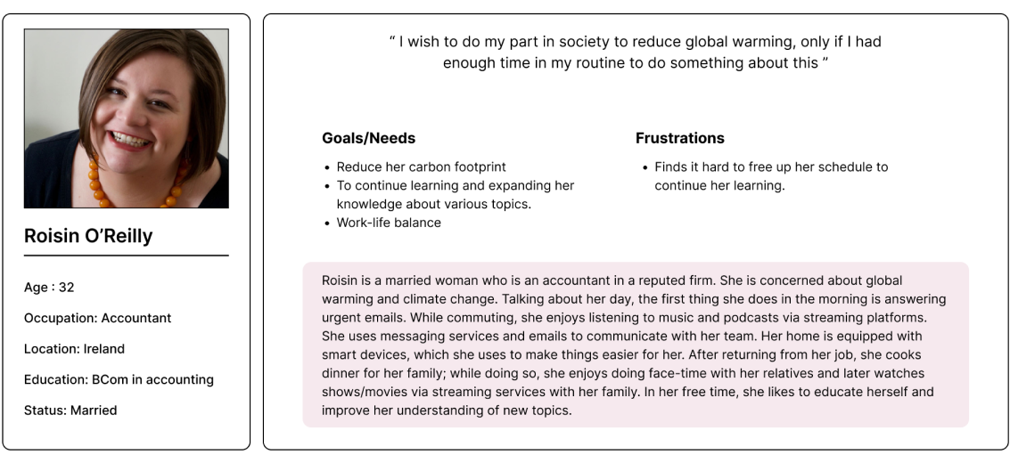
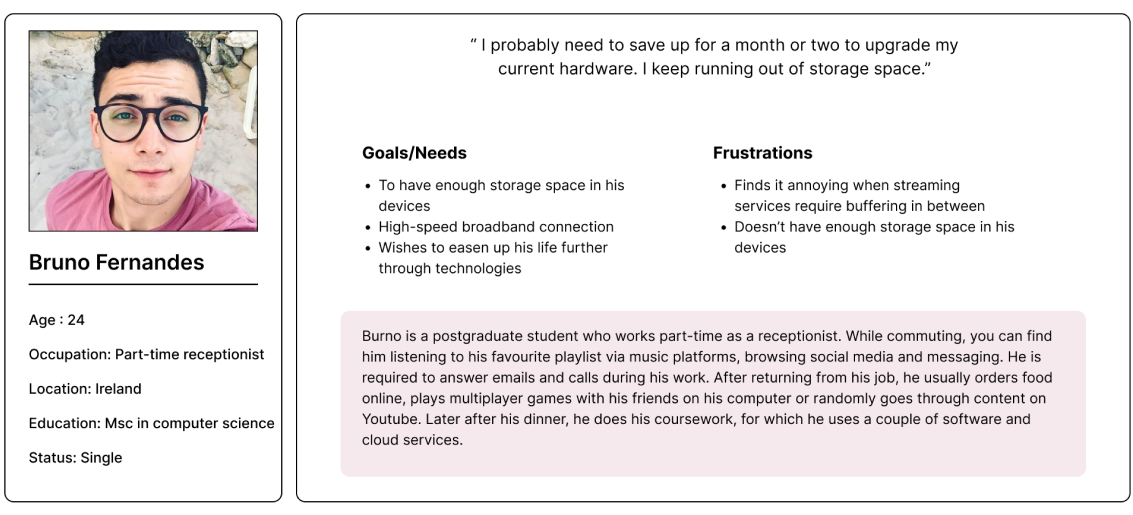
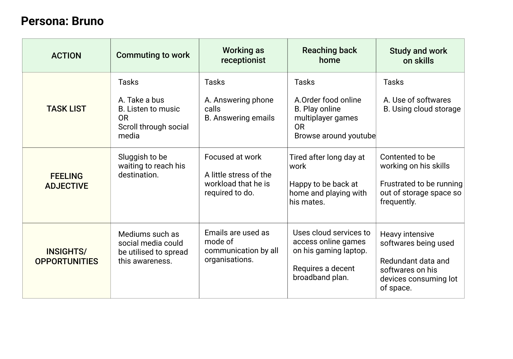
Personas
The co-design session and survey gave me a handful of insights to focus on and derive two personas out of them. The two groups can be classified as a tech-savvy audience and working professionals.
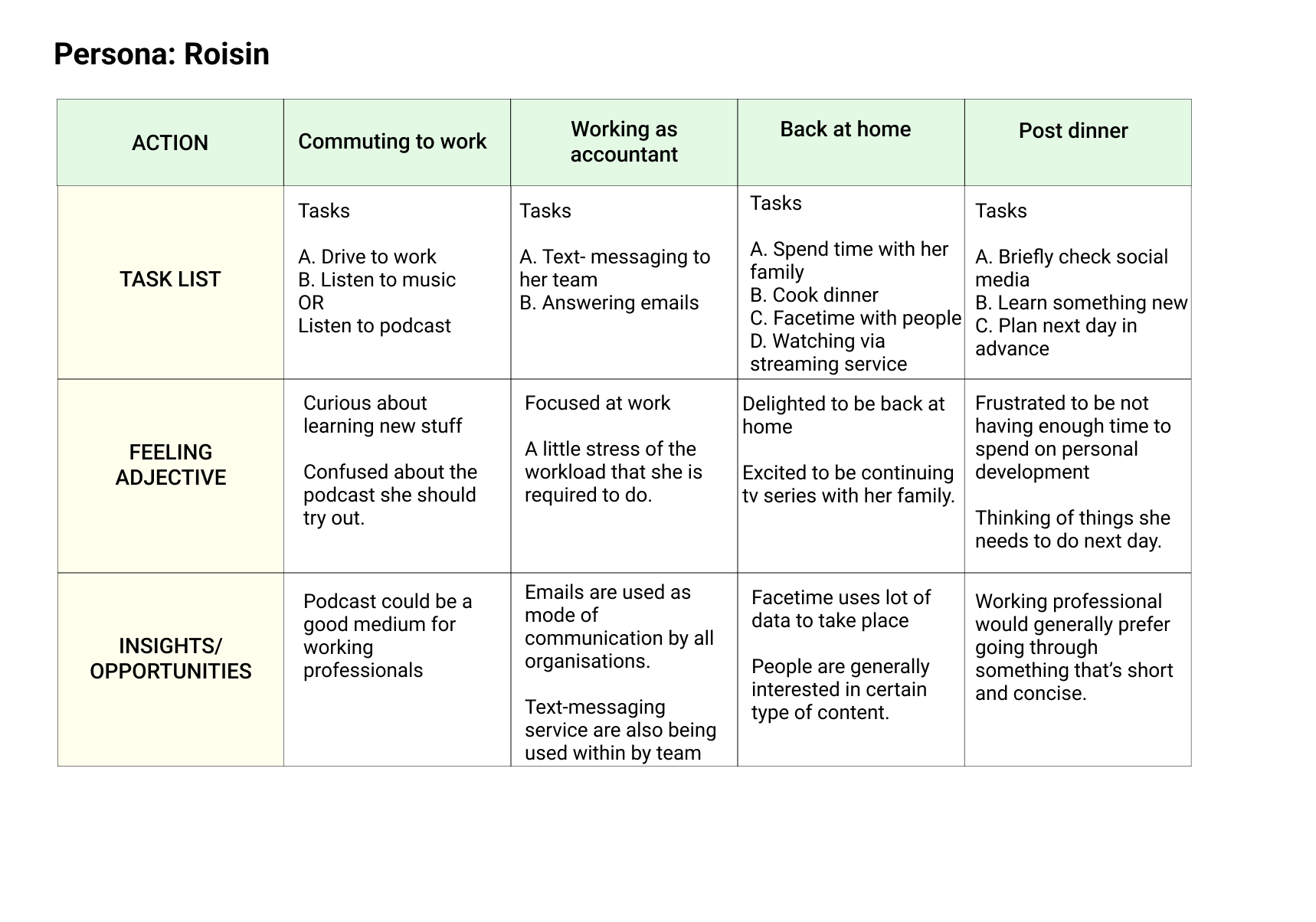
User Journey
I tried to put myself in the persona's shoes and see how they go about in a given day. The idea was to empathise with their journey and the tasks they have to do daily. While doing so it presented me with some areas that I could focus on and use this knowledge while designing my final artefact.
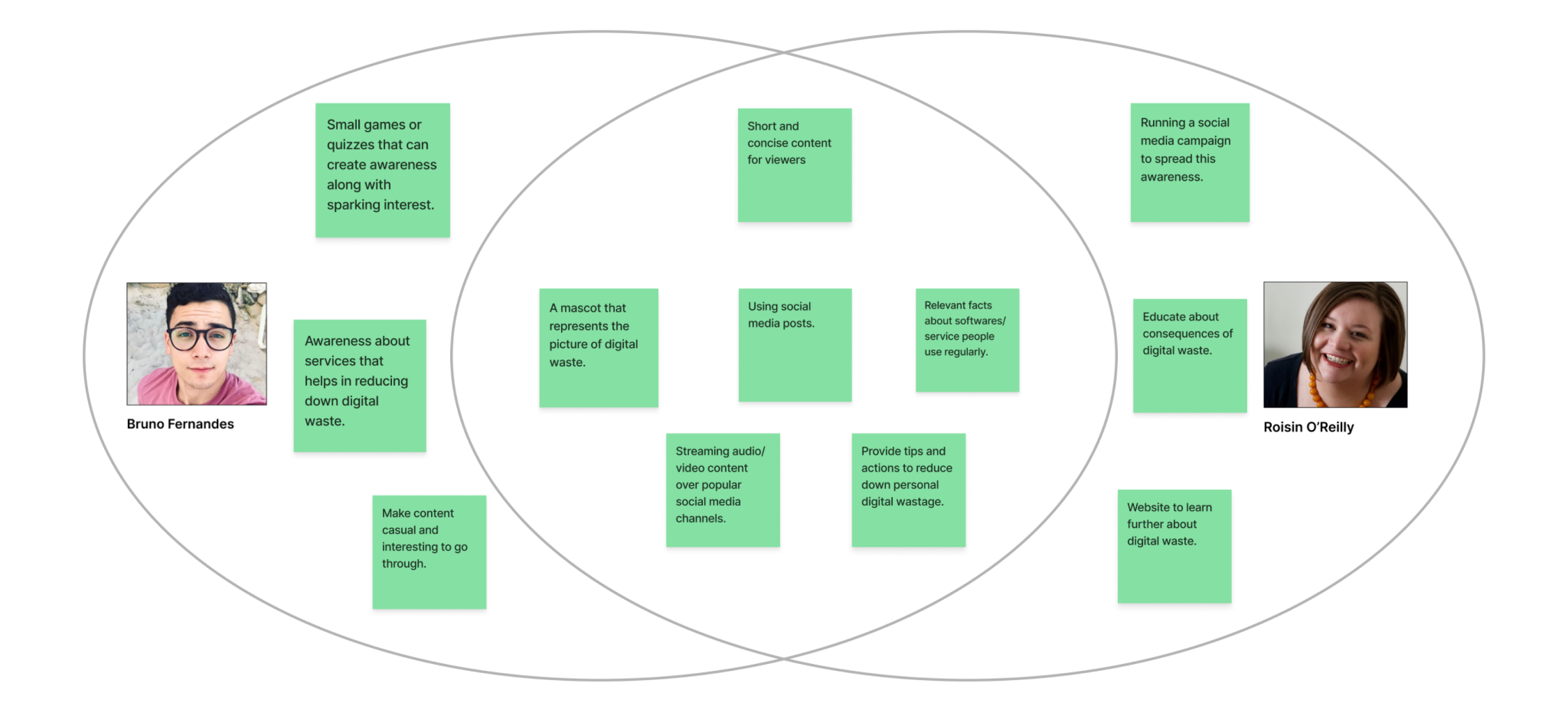
Ideation
Building value propositions
After ideating HMW statements with participants, I tried to match these ideas with the personas I had created earlier on to further filter the ideas. This helped in narrowing this digital artefact down to a particular scope.
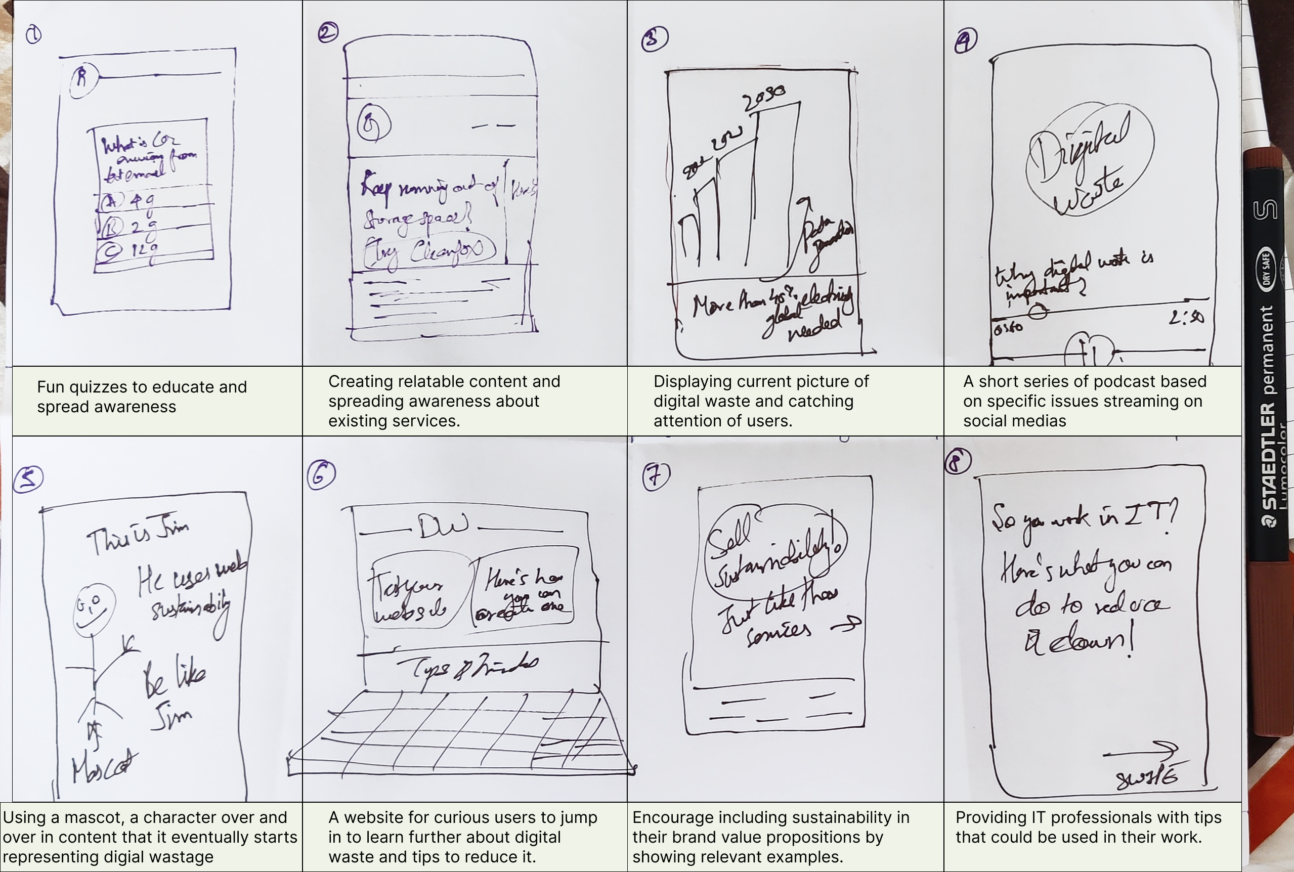
Crazy eights
Keeping the value propositions of my digital artefact in mind, I wanted to visualize and ideate in terms of content that could be used later. I decided to go ahead with the crazy eight exercises to sketch out eight rough ideas for my project quickly.
Prototyping
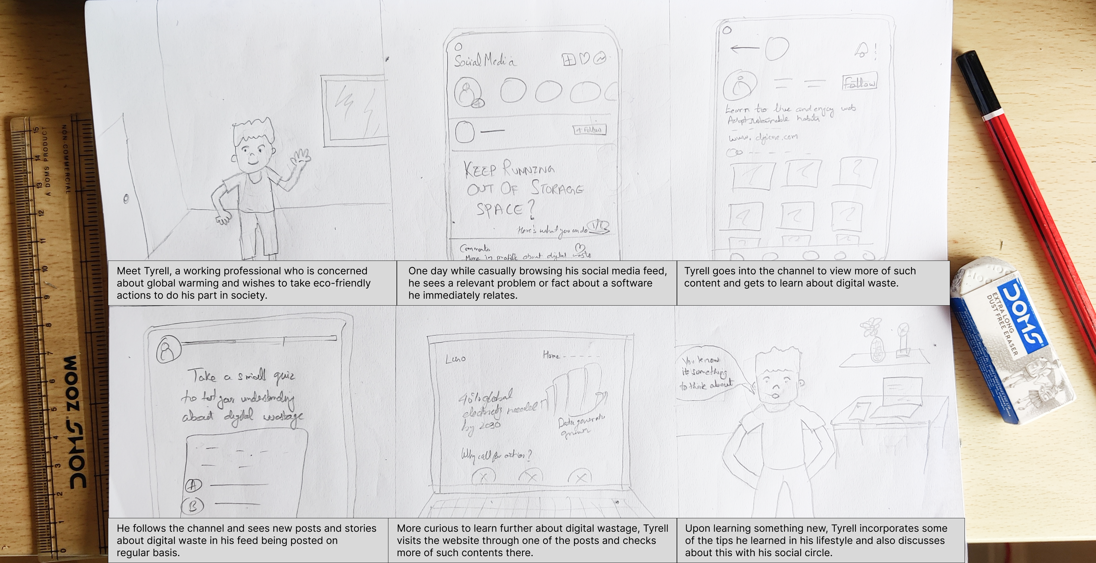
Big picture storyboarding
I tried to put myself into the user's shoes and visualize the journey they may have to undergo while using this artefact.
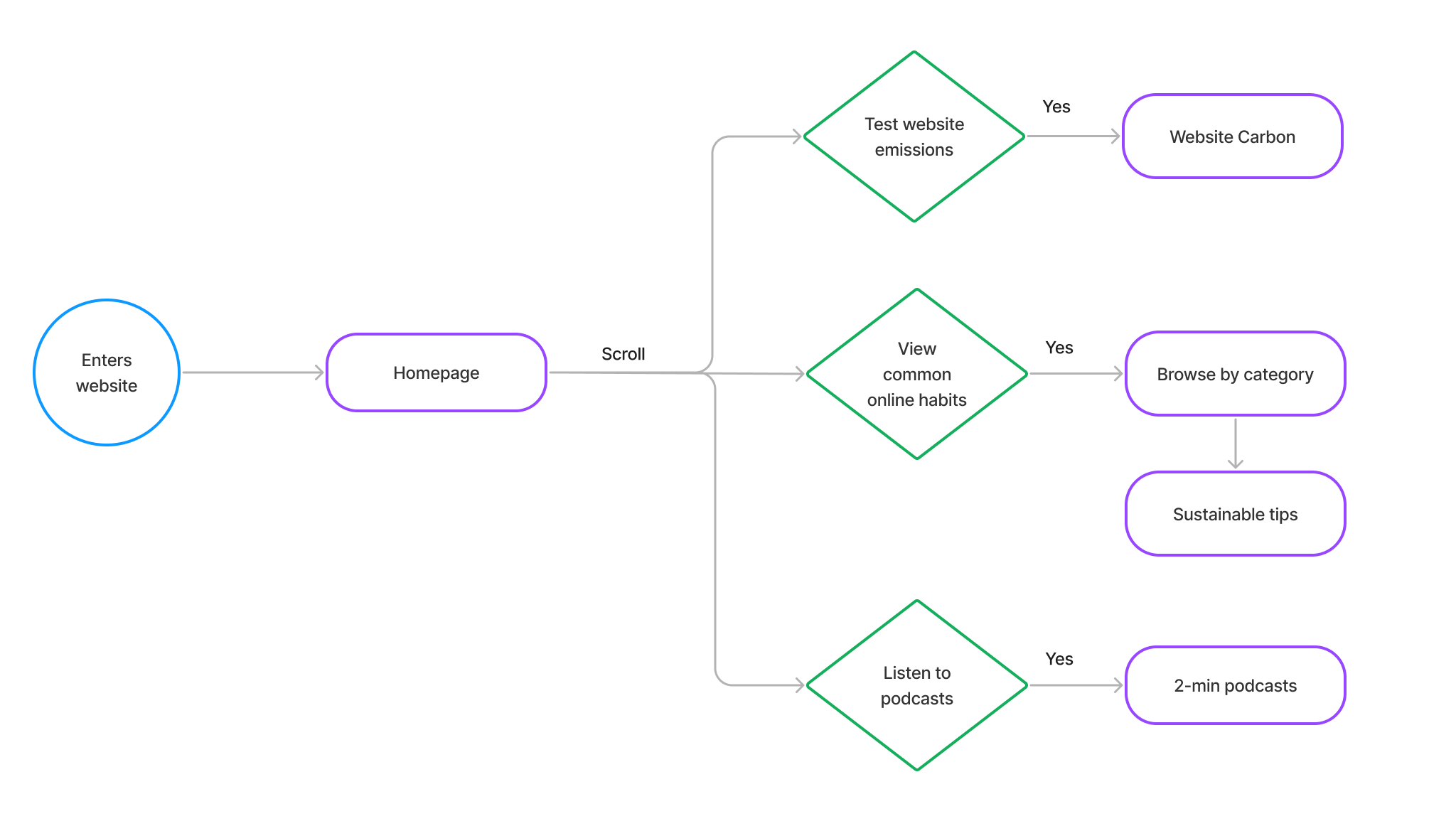
Structuring the website
The userflow below represents the flow of actions the users will have to take on the website to visit distinct sections.
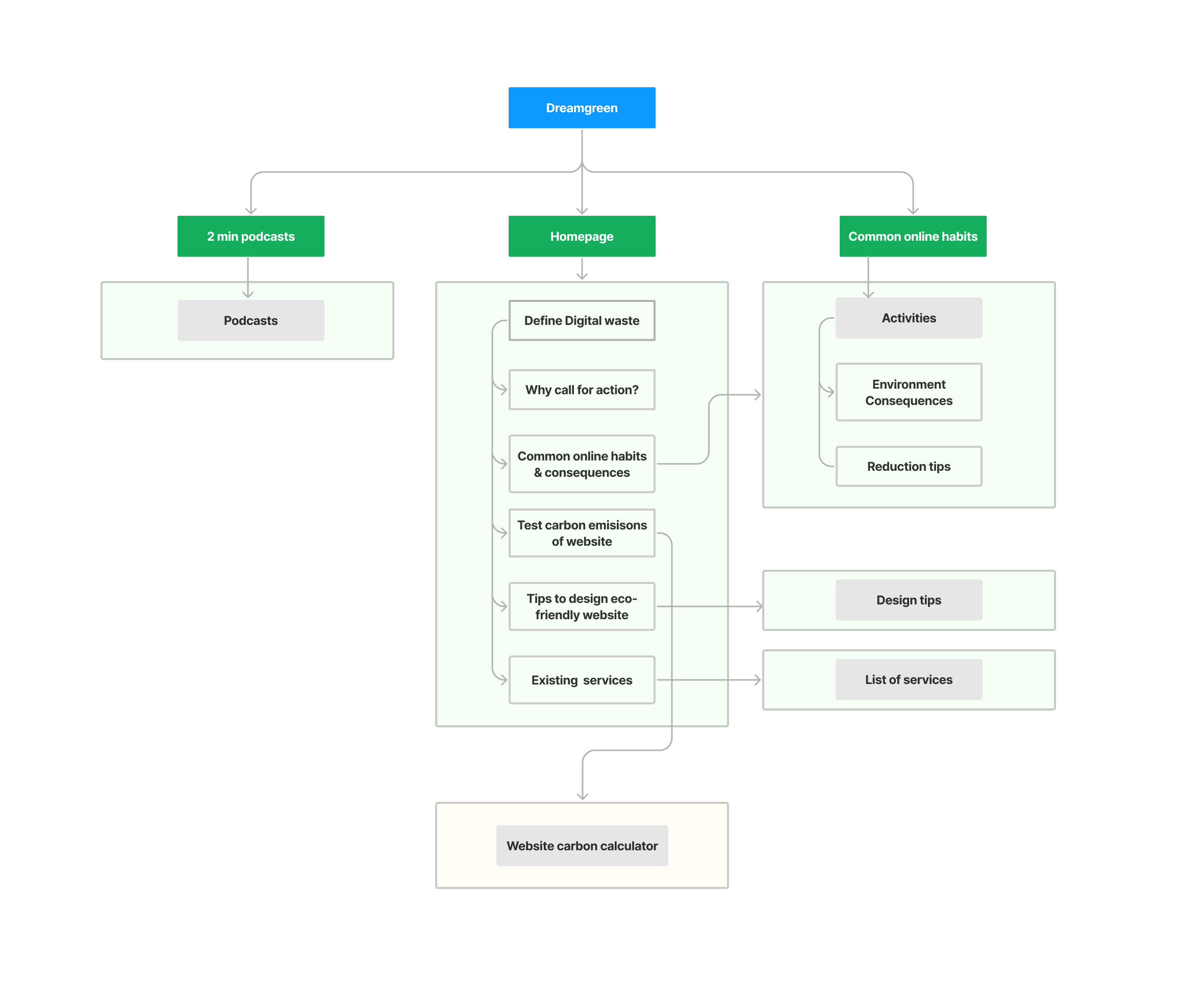
The next step was to place content in the interface so that it would be a mindless act for a user to get their tasks done efficiently. The below information architecture is an attempt at designing one for this project.
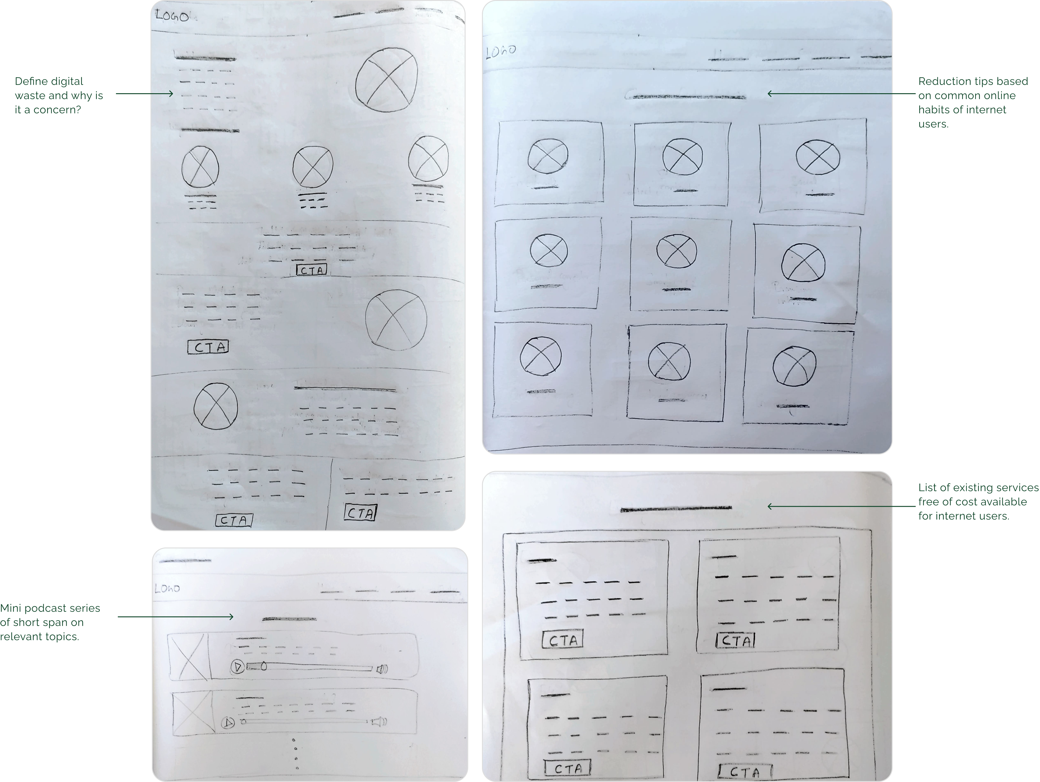
Lo-fidelity wireframes
The previous step helped in the creation of these abstract wireframes. These rough sketches helped in the visualisation of the website's interaction.
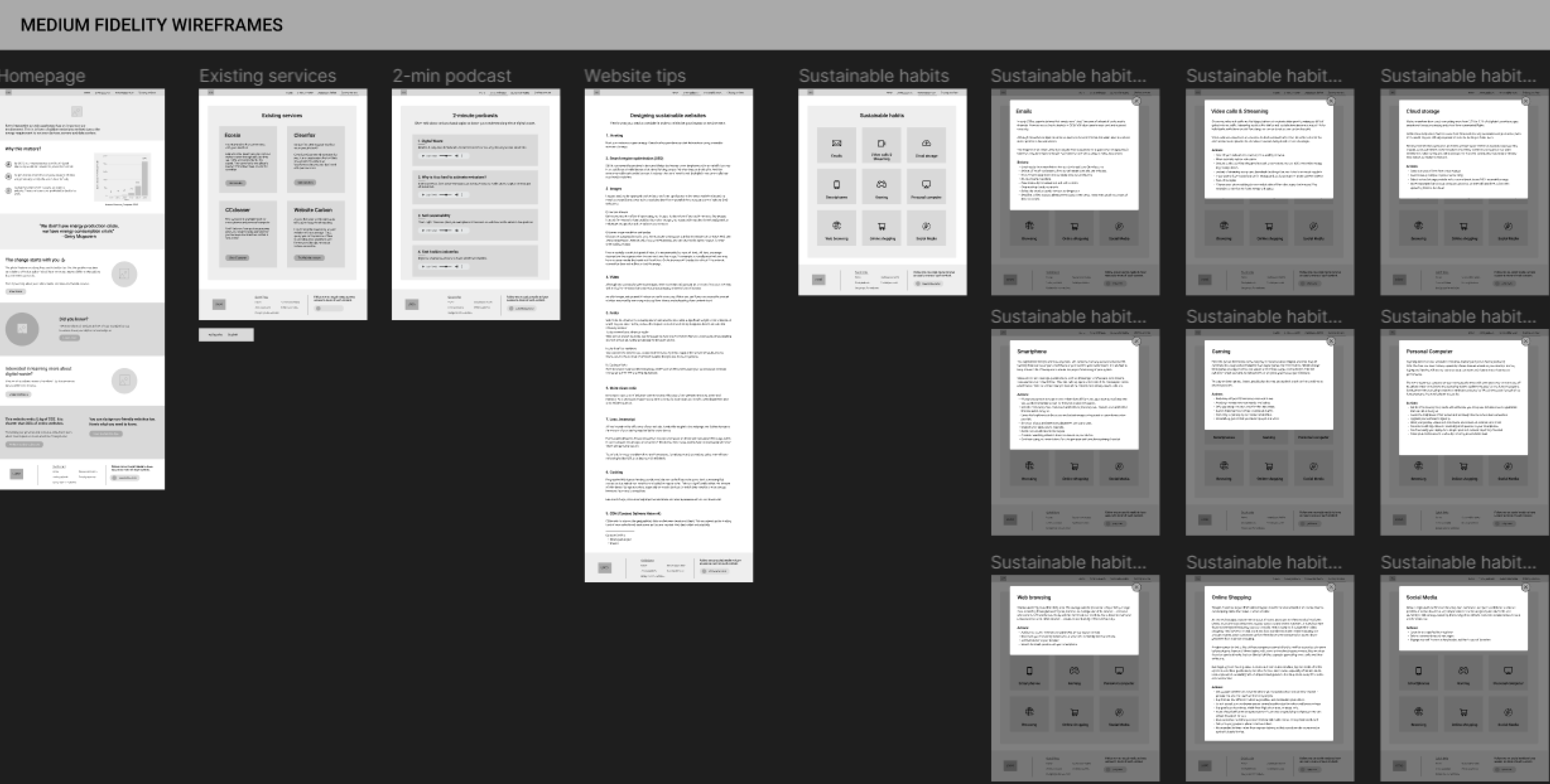
Medium fidelity wireframes
The initial paper-based wireframes were upgraded using the Figma prototyping tool to allow ease during remote testing with participants.
A specific focus was put on refining and working on the copywriting of this website. Since this website was about sharing relevant information, it was of utmost importance to test the website's interaction with the content to get insights for further improvement.
Usability testing
The medium fidelity version was converted into a working prototype and later used to get feedback from users. The cooperative run time guide was referred to while planning this usability testing.
Six participants were recruited; three of them had already been part of the co-design session. Therefore, they had a basic understanding of the project. The other three were newly recruited, allowing me to observe and gain new insights during de-briefing.
Preparation of material
1. Defining the specific tasks that were to be tested with the users
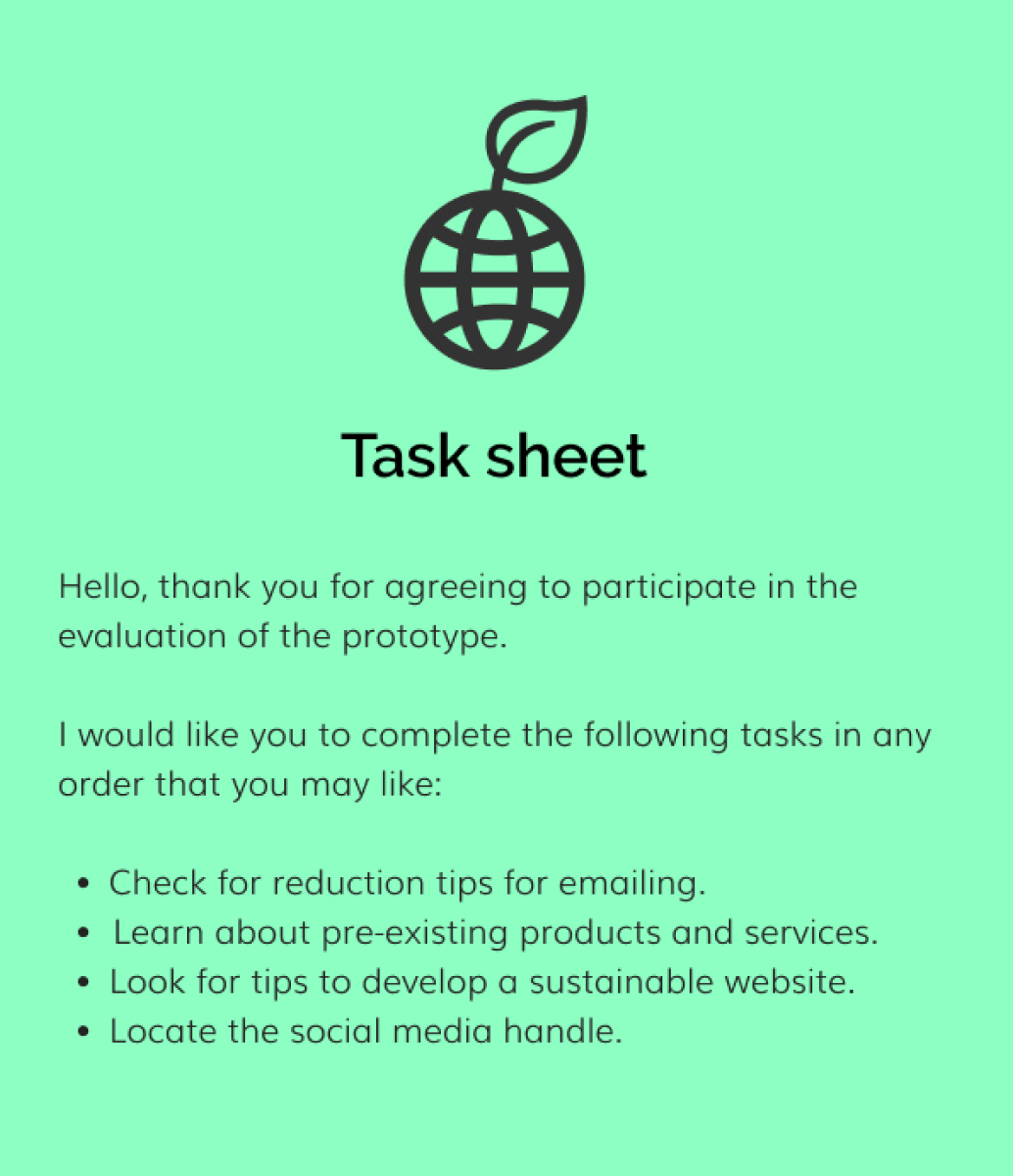
2. Listing out de-briefing questions in relation to tasks and overall concept
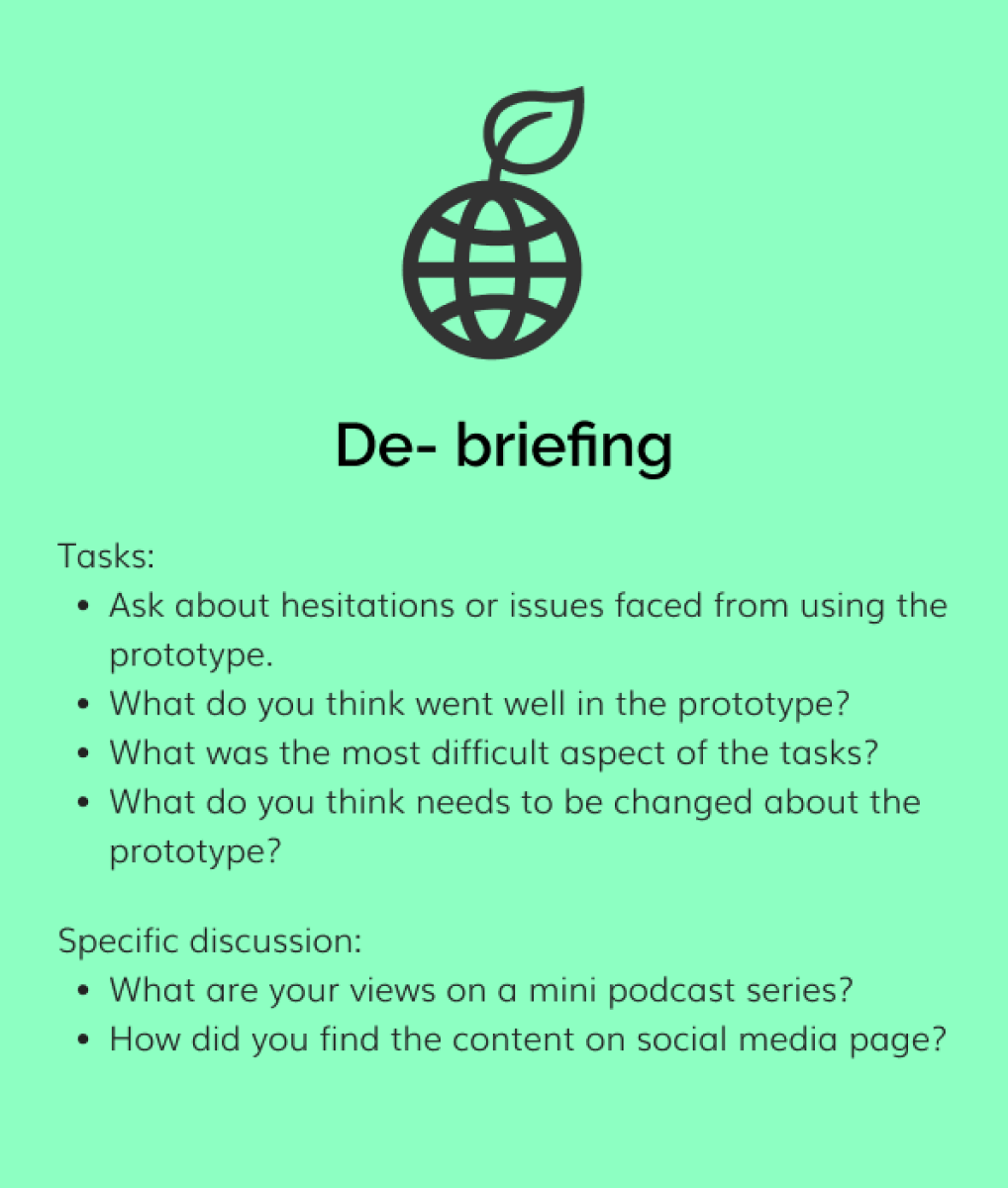
3. Working prototype
4. Populating the social media page with content
Evaluation outcomes
It was undoubtedly an exciting experience to view the designed digital artefact from the fresh perspectives of the users. After evaluating the prototype with the participants, I had a list of features and suggestions I could consider incorporating in the prototype's next iteration.
1. Changing wordings of call to action (CTA) buttons
While testing, some of the participants had faced issues in locating one of the tasks and brought to my attention that it could be more descriptive in nature.
Before
After
2. To make use of visuals instead of words
The participants appreciated viewing concise content throughout their experience of browsing the website and believed the same could be done with the header section. An appealing, relevant visual should be added behind it to get the idea across instead of a paragraph there.
Before
After
3. To further ease the navigation
Scroll to top button could be added in the homepage to enhance the user experience of the website. This page requires the users to scroll more when compared to rest of pages. So it could come in handy to the users. Additionally, The participants believed that the home link in the navigation bar was redundant as it is common practice to reach there by simply clicking the logo.
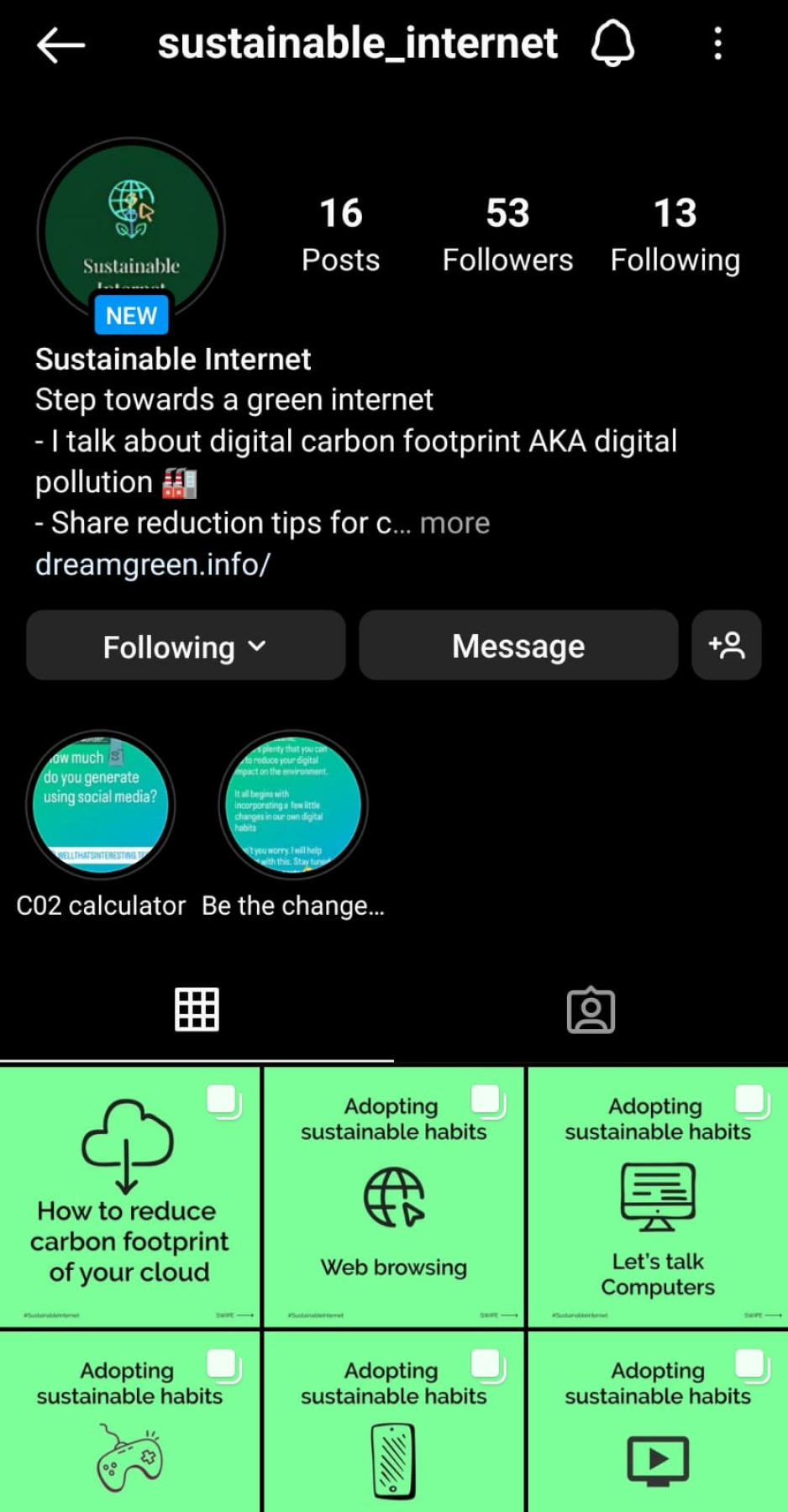
4. Suggestions on social media handle
I was advised to be diverse in terms of the content I share. The participants also shared their personal preferences during de-briefing and gave me insights into what kind of content would interest diverse users.
5. Separate section for developers
During de-briefing and having a general discussion, one of the participants believed that there could be a separate section for developers where they could learn about reduction tips relevant to their job positions.
What went well?
1. Layout, according to participants, made complete sense on the website.
2. Participants believed that by looking at the graph at first glance, they could relate to the seriousness of this problem.
3. The idea of a 2-min podcast received a thumbs up from everyone. One of the participants stated that listening to long lectures is not attractive to anyone; giving away information in such a short span makes it interesting. While one of the participant even offered himself as one of the guests if possible in this mini-series.
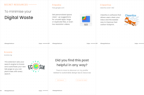
4. According to participants, the social media handle was promising. They find the posts to be concise and engaging—the overall theme related to the idea of my project.
Lessons learned
1. Getting initial feedback from participants
In one of the usability testing, I had mistakenly forgotten to give a short brief of the prototype. Surprisingly it led to more promising results. The user was trying to figure out himself what the website was about, allowing me to observe how someone would go about using the website if they had randomly landed on it. I continued to go ahead in the same manner with the other participants. Instead of telling the brief immediately, I requested them to figure out the website's purpose by themselves in a short span.
2. To ask open-ended questions
During de-briefing, I tried my best to stay clear from confirmatory questions where possible to allow flow of efficient communication to take place. At times, the participants would go a step ahead and provide me with unusual insights and ideas for my prototype.
3. To make small talk with participants
Having a casual talk with the participant at the very beginning of testing makes all the difference of how they perform later during testing. The participants showed enthusiasm and were open to having discussions with me on the digital artefact later in de-briefing.
Prototype and development
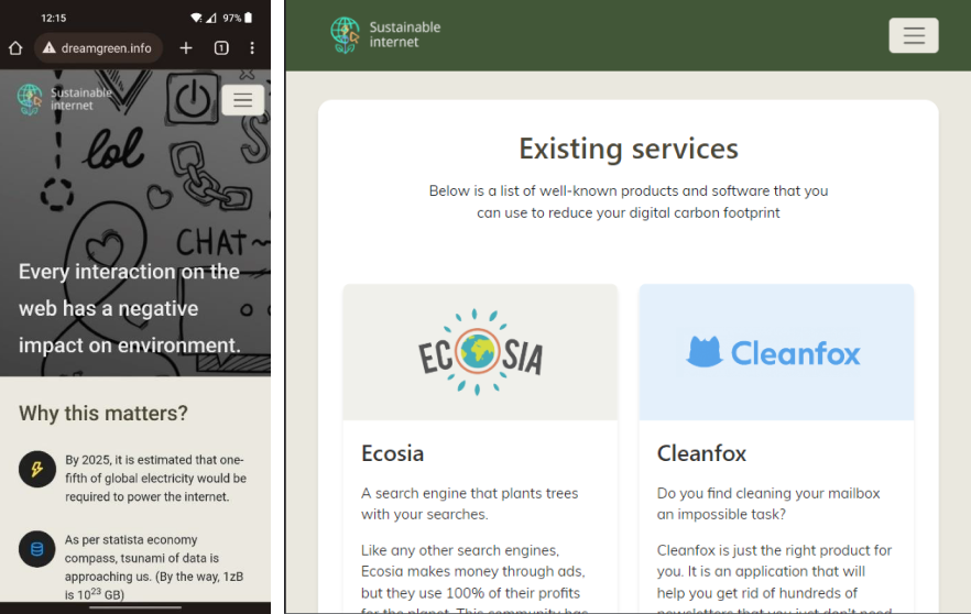
Since it was essential for this awareness medium to not be contributing towards the digital pollution itself. Therefore, while developing this website, the green practices were followed to design an eco-friendly website. The website should act as an example and guide others to develop similar websites. To minimise the impact further, this website was hosted on Greengeeks which is powered by renewable sources of energy.
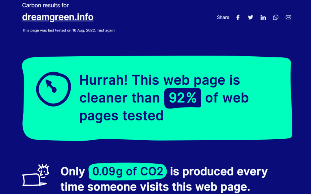
Testing emissions of website via Website Carbon
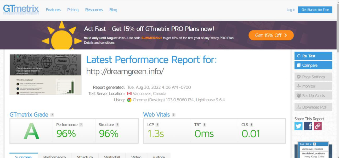
Testing website perfomance via GTmetrix
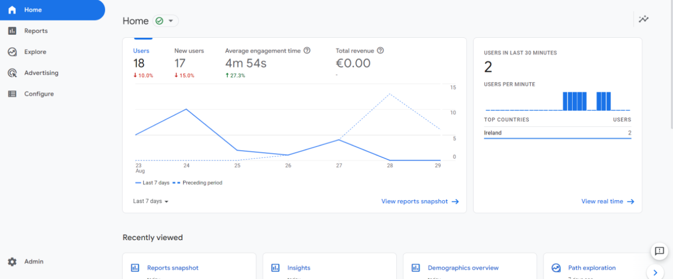
Website integrated with Google analytics for post-launch research
Responsive views on mobile and tablet
Project links

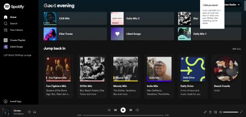
Liked the idea of a popup displaying facts about the website they are browsing.